Personalized Financial Dashboards for Smarter Decisions
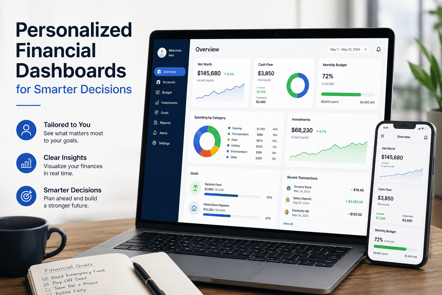
Personalized financial dashboards transform raw financial data into visual, real-time insights that help business owners spot trends, track cash flow, and make informed decisions without waiting for month-end reports. Instead of drowning in spreadsheets or relying on gut instinct, you get instant visibility into the metrics that matter most for your specific business model—from revenue trends and expense breakdowns to cash projections and customer profitability.
As CEO of Complete Controller, I’ve watched too many brilliant entrepreneurs fail not because their ideas were bad, but because they couldn’t see their financial reality until it was too late. The game-changer? Building a dashboard that shows exactly what you need to know, exactly when you need to know it—and nothing else.

What are personalized financial dashboards and why should you care?
- Personalized financial dashboards consolidate your scattered financial data into one interactive, visual command center that updates automatically
- Unlike generic reports, they adapt to your business model—showing MRR for SaaS companies, inventory turnover for retailers, or utilization rates for service firms
- Replace the endless cycle of requesting reports, waiting for updates, and making decisions on stale data with instant access to current numbers
- Enable pattern recognition that spreadsheets hide—seasonal trends, customer payment behaviors, expense creep—all visible at a glance
- Transform financial management from reactive firefighting to proactive strategy by answering critical questions in seconds instead of days
Building Your Core Financial Dashboard
Every business is unique, but certain metrics deserve prime real estate on any personalized financial dashboard. Start with revenue and profitability trends that show not just where you are, but where you’re heading. Add cash flow visualization for SME liquidity to track money in versus money out—because profitable businesses still fail when they run out of cash.
Your expense management view should break down costs by category: payroll, materials, rent, marketing, and those sneaky subscription fees that multiply when nobody’s watching. Include variance analysis comparing actual spend to budget, flagging overruns before they become problems. Days Sales Outstanding (DSO) reveals how quickly customers pay, while aging receivables show which invoices need immediate attention.
Essential metrics to monitor
- Top-line revenue with growth rate and seasonal patterns
- Gross and net profit margins by product line or service
- Cash position today plus 30-60 day forecast
- Burn rate and months of runway remaining
- Customer acquisition cost versus lifetime value
The Technology That Powers Personalized Financial Dashboards
Modern financial dashboard platforms pull data from multiple sources—your accounting software, CRM, payment processors, and bank feeds—creating a unified view without manual data entry. Tools like Power BI, Tableau, or specialized personalized budgeting software for SMBs offer drag-and-drop interfaces that non-technical users can customize without IT support.
The magic happens through automated data integration. Your QuickBooks or Xero transactions flow directly into visual charts and graphs. Bank reconciliations update cash positions daily. Invoice aging refreshes automatically. This real-time architecture means you’re always working with current information, not last month’s snapshot.
Key technical features
- Cloud-based access from any device, anywhere
- Real-time expense tracking dashboard with drill-down capability
- Automated alerts for threshold breaches or unusual activity
- Interactive reports that let you filter by date, department, or customer
- API connections to integrate with your existing tech stack
Customization: Why One Size Never Fits All
Generic dashboards fail because they show everyone the same metrics regardless of business model. A personalized investment performance dashboard for a venture-backed startup looks nothing like a cash flow tracker for a bootstrapped service business. The metrics that matter depend entirely on how you make money and what drives your decisions.
SaaS companies need monthly recurring revenue (MRR), churn rate, and customer lifetime value front and center. Retailers focus on inventory turnover, shrinkage, and margin by product category. Professional services firms track utilization rates, project profitability, and work-in-progress. The personalized financial dashboard template you choose should reflect your specific business model, not force you into an irrelevant framework.
Industry-specific customizations
- E-commerce: Cart abandonment rates, customer acquisition costs, seasonal inventory levels
- Agencies: Project margins, resource utilization, pipeline velocity
- Manufacturing: Production efficiency, material costs, quality metrics
- Healthcare: Patient volume, insurance mix, collection rates
Real Results: How Dashboards Transform Decision-Making
Consider this: CB Insights found that 38% of startups fail because they run out of cash—not because they’re unprofitable. A marketing agency I worked with discovered through their financial data visualization dashboard that invoices averaged 45 days to collect. By setting up automated payment reminders triggered by dashboard alerts, they cut collection time to 28 days and freed up $120,000 in working capital.
Another client, a growing e-commerce brand, used portfolio performance tracking to identify that 20% of their SKUs generated 80% of profit. They doubled down on winners, eliminated losers, and increased overall margin by 15% within six months. These aren’t isolated wins—they’re predictable outcomes when you can actually see what’s happening in your business.
Research from 3M Corporation demonstrates that people process visual information 60,000 times faster than text. When you transform rows of numbers into clear visual trends, insights jump out that spreadsheets would have buried. That speed advantage translates directly into competitive advantage when markets shift or opportunities emerge.

Implementation Strategy for Maximum Impact
Start simple with five to seven core metrics—resist the temptation to track everything. Focus on numbers that drive actual decisions, not vanity metrics that just look interesting. Set up financial data visualization dashboard accuracy through regular reconciliation to ensure your pretty charts reflect reality.
Establish review rhythms that match metric urgency. Check cash daily if you’re in growth mode or facing tight margins. Review operational KPIs weekly to catch trends early. Save strategic metrics for monthly deep dives. The key is consistency—dashboards only drive change when checking them becomes habit, not occasional curiosity.
Implementation timeline
- Start Here (Days 1–14): Evaluate current reports and pinpoint the metrics that truly drive decisions
- Next Up (Days 15–28): Choose the right platform and connect your key data sources
- Time to Build (Days 29–42): Design your first dashboard around core financial and operational KPIs
- Bring It to Life (Days 43–56): Equip your team, define ownership, and establish review rhythms
- Keep Evolving: Refine, automate, and expand based on the questions your data still isn’t answering
Advanced Features That Multiply Dashboard Value
Beyond basic reporting, modern fintech analytics platforms offer predictive capabilities that transform dashboards from rearview mirrors into crystal balls. Automated financial insights use machine learning to spot anomalies—like a vendor suddenly billing 30% more than usual—before they impact your bottom line.
Scenario modeling lets you test “what if” questions instantly. What if our biggest customer leaves? What if we land that enterprise deal? What if material costs spike 20%? Your retirement planning toolkit can project how today’s decisions impact your long-term wealth accumulation, while goal-based saving trackers show progress toward specific milestones like debt elimination or equipment purchases.
Power user features
- Predictive cash flow modeling based on historical patterns
- Anomaly detection for expense spikes or revenue drops
- Scenario planning for strategic decisions
- Benchmarking against industry standards
- Mobile alerts for critical threshold breaches
Common Mistakes That Kill Dashboard Adoption
The biggest dashboard killer? Information overload. When you cram 30 metrics onto one screen, users get paralyzed and ignore everything. Keep primary views clean with drill-down options for detail. Another adoption killer is stale data—if numbers update weekly instead of daily, people stop trusting and checking the dashboard.
Poor mobile experience also limits usage. Your dashboard should work flawlessly on phones and tablets since critical decisions don’t wait for you to reach a desktop. Finally, launching without training guarantees failure. People need to understand not just how to read the dashboard, but how to act on what they see.
Adoption best practices
- Limit primary view to 5-7 critical metrics
- Ensure mobile-responsive design for anywhere access
- Automate data refresh at least daily
- Create action protocols for common scenarios
- Celebrate wins driven by dashboard insights
Making Financial Dashboards Part of Your DNA
The most successful implementations treat dashboards as decision-making infrastructure, not pretty reports. Start every leadership meeting with a dashboard review. Base performance discussions on dashboard metrics. Tie bonuses and incentives to numbers everyone can see and track.
When variances appear, drill down immediately to understand root causes. When positive trends emerge, double down on what’s working. The dashboard becomes your single source of truth, eliminating arguments about “whose numbers are right” and focusing energy on “what do we do about it?”
Remember, the goal isn’t to become a data analyst—it’s to make better decisions faster. The right personalized financial dashboard turns financial management from a monthly chore into a daily competitive advantage. Investment tracking dashboard strategies help you see opportunities while there’s still time to capture them.
Your Next Steps
Stop managing your business through the rearview mirror of monthly reports. Start with these action items: First, list the five questions you ask most often about your business finances. Second, identify where that data currently lives and how long it takes to get answers. Third, choose one critical metric to track daily for the next week—cash position, sales pipeline, or expense run rate.
The businesses that thrive in uncertainty aren’t necessarily the biggest or best-funded—they’re the ones that see clearly and move quickly. I’ve built Complete Controller on this principle: give business owners the financial visibility they need to make confident decisions.
Your financial data tells a story about where you’ve been and where you’re going. A well-designed dashboard makes sure you’re reading that story in real-time, not waiting for the quarterly summary. Ready to stop guessing and start knowing? Visit Complete Controller for expert guidance from the team that pioneered cloud-based bookkeeping and controller services. We’ll help you build the financial visibility that turns good businesses into great ones.

Frequently Asked Questions About Personalized Financial Dashboards
How are personalized financial dashboards different from standard financial reports?
Standard reports show historical data in static formats, usually weeks after month-end. Personalized financial dashboards display real-time data in interactive, visual formats customized to your specific business model and decision needs, updating automatically throughout the day.
What’s the ideal frequency for reviewing financial dashboards?
Review frequency depends on the metric’s urgency: cash position (daily), operational KPIs like sales and expenses (weekly), and strategic metrics like market share or product profitability (monthly). The key is consistency—pick a rhythm and stick to it.
Can small businesses with limited budgets benefit from financial dashboards?
Absolutely. Many personalized budgeting software platforms offer affordable SMB plans starting under $100/month. The ROI typically pays for itself within 30 days through better cash management, faster collections, or eliminated waste.
How complex is it to integrate data from multiple sources into one dashboard?
Modern platforms make integration surprisingly simple. Most connect directly to QuickBooks, Xero, bank accounts, and payment processors through pre-built connectors. Initial setup takes 2-4 weeks, but ongoing maintenance is minimal—the system runs itself.
How long does it take to see results from implementing a financial dashboard?
Quick wins appear within days—like spotting overdue invoices or expense anomalies. Strategic improvements in cash management and profitability typically emerge within 30-60 days as you act on insights. Full transformation of decision-making culture takes 3-6 months of consistent use.
Sources
- CB Insights. (February 11, 2021). The Top 20 Reasons Startups Fail. https://www.cbinsights.com/research/startup-failure-reasons-top/
- Charles Duhigg. (February 28, 2012). The Power of Habit. The New York Times Magazine. https://www.nytimes.com/2012/03/11/magazine/the-power-of-habit.html
- Complete Controller. Liquidity Key to SME Success. https://www.completecontroller.com/liquidity-key-to-sme-success/
- Complete Controller. Importance of Reconciling Your Accounting Statements Regularly. https://www.completecontroller.com/importance-of-reconciling-your-accounting-statements-regularly/
- Complete Controller. How to Streamline Your Investment Portfolio. https://www.completecontroller.com/how-to-streamline-your-investment-portfolio/
- Investor.gov. Teacher Resources Retirement Toolkit. https://www.investor.gov/additional-resources/information/youth/teachers-classroom-resources/teacher-resources-retirement-toolkit
- U.S. Small Business Administration. Manage Cash Flow. https://www.sba.gov/business-guide/manage-your-business/manage-cash-flow
- Wikipedia. Data and Information Visualization. https://en.wikipedia.org/wiki/Dataandinformation_visualization
- Zabisco. (February 20, 2018). 8 3M Visual Marketing Statistics You Need to Know. https://www.zabisco.com/blog/8-3m-visual-marketing-statistics-need-know/
 About Complete Controller® – America’s Bookkeeping Experts Complete Controller is the Nation’s Leader in virtual bookkeeping, providing service to businesses and households alike. Utilizing Complete Controller’s technology, clients gain access to a cloud platform where their QuickBooks™️ file, critical financial documents, and back-office tools are hosted in an efficient SSO environment. Complete Controller’s team of certified US-based accounting professionals provide bookkeeping, record storage, performance reporting, and controller services including training, cash-flow management, budgeting and forecasting, process and controls advisement, and bill-pay. With flat-rate service plans, Complete Controller is the most cost-effective expert accounting solution for business, family-office, trusts, and households of any size or complexity.


 Brittany McMillen
Brittany McMillen
Brittany McMillen